Storytelling sections
Products sell better when something on the page explains them. These sections carry your words: your story, your process, your reassurances, and what other people say about you. You reach for them when a shopper is interested but not yet convinced, or when a plain product grid leaves an obvious question hanging. Most of them can sit on any page, so you can put the right explanation exactly where the hesitation happens.
Rich text
Section titled “Rich text”Gives a heading and a passage of formatted copy their own space, with an optional Caption above it, a First button with its Link, and a Show a drop cap option for an editorial opening letter. Reach for it when you want to speak in your own voice between two product sections: a short brand statement on the homepage, a note about how you make things, a welcome line above a collection. Content width sets how wide the text runs, and a narrower setting keeps lines comfortable to read. Add it from Add section in the theme editor, then drag it into position.
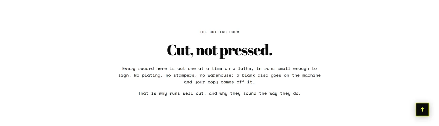
Image with text
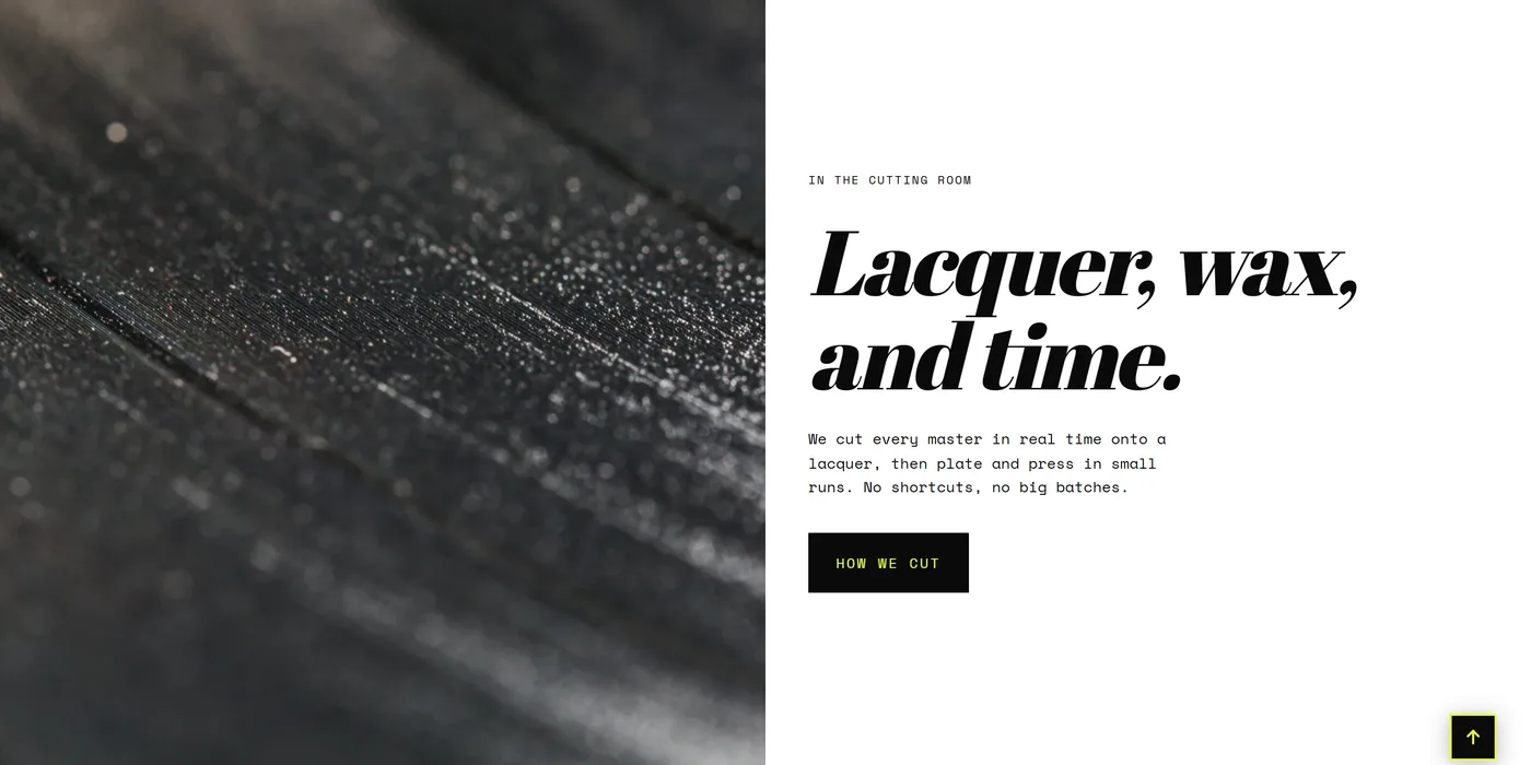
Section titled “Image with text”Pairs one image with a heading, Body copy, and an optional button, so a claim and its proof arrive together. Use it when the words need something to look at: the maker at the bench, the fabric up close, the workshop behind a promise about quality. Media position decides which side the image sits on, and alternating it across two stacked sections gives a page rhythm. Image ratio and Mobile image ratio let the crop differ on phones, while Content vertical alignment squares the text against tall or short images. Choose this over Rich text whenever you have a photo worth showing.
Multicolumn
Section titled “Multicolumn”Holds repeatable Column blocks, each with its own image, heading, and text. Use it for three or four points of equal weight: your product ranges, what is included in a kit, the reasons people choose you. Columns on desktop and Columns on mobile set the grid, Enable swipe on mobile turns the row into a swipeable strip on phones, and Column divider, Show column numbers, and Icon frame decide how structured the row looks. Pick Multicolumn over Icon list when each point needs a picture and a sentence or two rather than a label.
Icon list
Section titled “Icon list”Holds Item blocks: an icon with a short line of text. This is the reassurance strip that sits under your banner or just above the footer, covering free shipping, easy returns, a guarantee, or secure checkout. Icon size and Columns on desktop set the scale, Text alignment tunes the look, and Layout with Autoplay and Speed can keep the row gently moving. Keep every item to a few words. If a point needs explaining, it belongs in Multicolumn instead.
Accordion
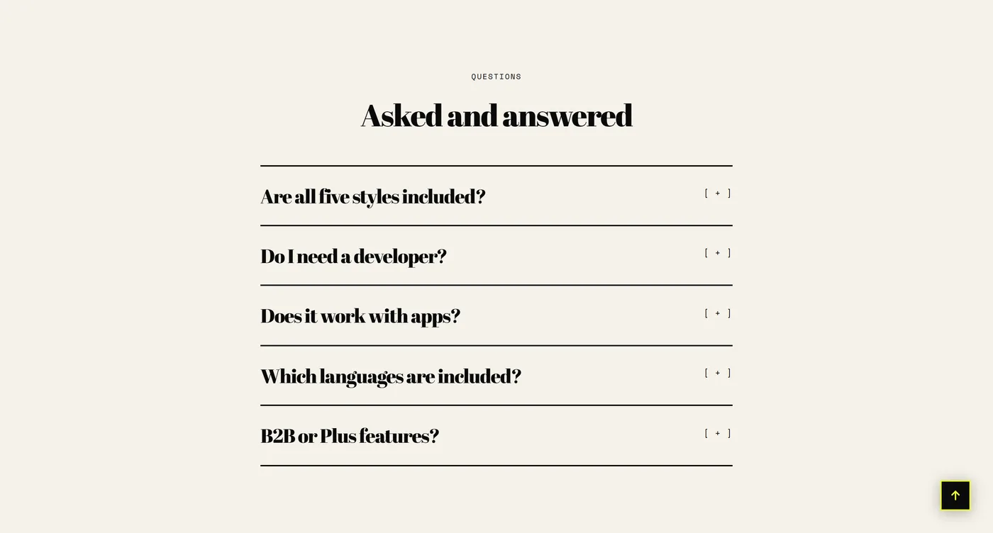
Section titled “Accordion”Collapsible Question blocks, each with a question and its answer. Use it where detail would otherwise crowd a page: sizing, care instructions, delivery windows, or the small print under a landing page offer. Behavior controls how the questions open, Show dividers sets how separated they look, and a Button label with a Link sends readers on for more. Choose Accordion for a handful of questions attached to a specific page. Choose the FAQ section below once you have enough answers to need categories and search.
Pull quote
Section titled “Pull quote”One sentence, set large, with Quote, Name, and Role or source underneath. Use it for a line worth stopping for: a founder’s reason for starting, a sentence from a review that says what you would struggle to say yourself, a phrase from a magazine write-up. Text alignment and Content width control how much of the page it takes. Choose this over Testimonials when a single quote will do more work than six, and place it between heavier sections so it has room to breathe.

Timeline
Section titled “Timeline”Holds Entry blocks that run in order, under an optional Caption, Heading, and Body intro. Use it for anything with a date attached: the year you started, the move to a bigger workshop, a harvest or production calendar, the milestones behind a heritage claim. Orientation changes whether the entries run across the page or down it, which matters most when you have more than four. Four to six entries is usually plenty. Choose Timeline when you are describing what has already happened, and Steps when you are describing what happens next.
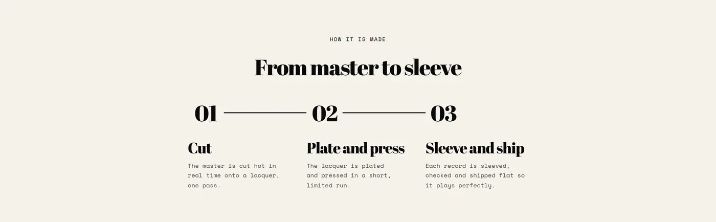
Holds numbered Step blocks with the same Caption, Heading, and Body intro as Timeline. Use it for a process the shopper takes part in: how made-to-order works, how a subscription runs, how to measure before choosing a size, what happens after they place an order. Orientation sets whether the steps read across or down, and Content width keeps them from stretching too wide. Three or four steps is the sweet spot, because a longer list starts to read as effort rather than clarity.
Press coverage
Section titled “Press coverage”Holds Press mention blocks for real coverage you have earned, with Columns on desktop setting how many sit in a row and a “View all” label with a Link for a fuller press page. Use it once you have been written about, because a named outlet next to a quoted line carries weight that your own copy cannot. If all you have is a row of marks with nothing quotable attached, the Logo list section is the better fit. Keep every mention accurate and attributed.
Testimonials
Section titled “Testimonials”Holds Testimonial blocks for customer quotes you have collected. Use it on the homepage, a collection page, or below a product to answer the question shoppers ask silently: does this actually work for people like me. Layout with Autoplay and Speed decides whether quotes sit in a grid or rotate, Columns on desktop and Columns on mobile set the density, and Show avatars and Style change how personal each card feels. Short, specific, real quotes beat long polished ones. Three good ones are enough.
The main section of your FAQ page, so it comes with the template rather than being added by hand. It holds Category blocks and Question blocks, so answers can be grouped instead of listed in one long run. Category navigation gives readers a way to jump straight to a group, Show search with Search placeholder lets them type what they need, and Behavior controls how answers open. To use it, create a page in Online Store → Pages, then set its Theme template to the FAQ template. See Pages and contact for the full flow.