Header, footer, and bars
Most sections belong to one page. This family belongs to all of them: the header at the top, the footer at the bottom, the slim bars around them, and the drawers that slide in for the cart and for search. They carry your logo, your menus, your policies, and the moments that move a shopper toward checkout, so they do more work than any single page section. You will find them at the top and bottom of the theme editor sidebar rather than in the page’s own section list.
Header
Section titled “Header”The Header sits on every page and holds your logo, your menu, and the search and cart icons. Choose your menu under Menu, then shape it: Desktop layout sets how the row is arranged, while Desktop submenus and Mega menu columns decide whether drop-downs stay compact or open into a wide panel. Mobile menu style covers the same ground on phones, and Sticky behavior keeps the header in reach on long pages. Show search puts the search icon in front of shoppers, and Frame the header icons and Number the navigation items add character. The Image and Inverse image settings give the header its logo, including a second version for light-on-dark moments. Add a Mega menu promo block to feature an image inside a drop-down. See Header and navigation for menu-building.
Announcement bar
Section titled “Announcement bar”The Announcement bar is a thin strip in the header area for news that expires: free shipping over a threshold, a sale end date, an order-by date before a holiday. Each Message block holds its own line of text, and when you add more than one, Autoplay, Speed, Transition, Motion, and Direction control how they cycle. Text case and Show a close button finish the look. Keep it to two or three messages so each one is actually read. Open it from the header area of the editor sidebar, where you can drag it to sit above or below the header.
Top bar
Section titled “Top bar”The Top bar is a quiet line for details that never change: Phone, Email, a short Note such as your dispatch promise, and your social links. Turn on Show contact icons and Show social media icons to make them scannable, set Text case to match your header, and use Show on mobile to hide the row on phones where space is tight. Reach for it when customers call or email you before ordering. Choose the Top bar for standing facts and the Announcement bar for messages that rotate and expire. Add it with Add section in the header area.
Footer
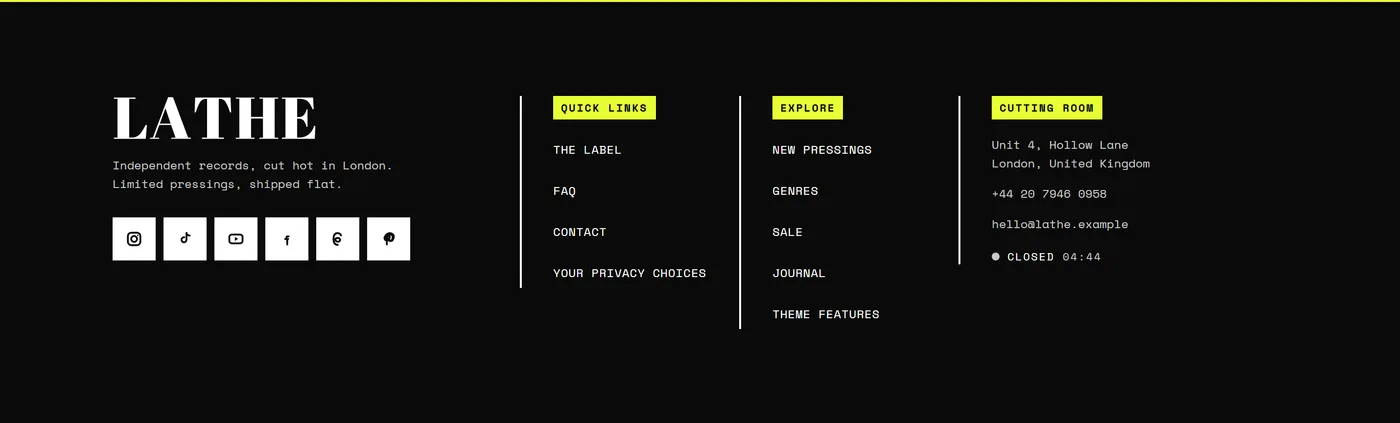
Section titled “Footer”The Footer is your second navigation. Shoppers who scroll to the bottom are usually looking for something specific, so give them somewhere to go. Build it from blocks: Menu column for link lists, Brand for your logo and a short line about the store, Newsletter for signups, Social media, Contact, Image, App links, and Custom Liquid for anything bespoke. Drag blocks to reorder them. Column heading style, Link case, and Column band style set the tone, Show oversized brand wordmark with Wordmark text makes a bold closing statement, and Menu columns on mobile keeps the phone view tidy.
Bottom bar
Section titled “Bottom bar”The Bottom bar is the closing line beneath the footer, and it handles the practical items rather than browsing. Turn on Policy links so your shipping, returns, and privacy pages are always one click away, and Show payment icons so shoppers see how they can pay before they commit. Show copyright, Show year, and Extra copyright text build the credit line, Show “Follow on Shop” button adds a follow option, and Back to top with Floating button side helps on long pages. The rule of thumb: the Footer holds what people browse, the Bottom bar holds what people check.

Cart drawer
Section titled “Cart drawer”The Cart drawer slides in over the current page when a shopper adds an item, so they never lose their place. Use After adding to cart to decide whether it opens automatically, and Animate items to the cart icon for a small confirmation that something landed. Show free shipping progress nudges a slightly larger order, Show recommendations with Recommendations heading and Recommended products offers a natural add-on, and Show order note, Show gift wrapping, and Show discount code field cover the requests that otherwise become emails. Show express checkout buttons shortens the last step. It appears when your cart opens as a drawer, which you set in Cart settings.
Search drawer
Section titled “Search drawer”The Search drawer opens over the page when a shopper clicks the search icon, keeping them in context. Enable predictive search shows matches as they type, Layout and Results per group control how much you show at once, and Show recent searches brings back what they looked at before. Fill the quiet first moment with Popular searches menu and Featured collection, so an empty search box still points somewhere useful. Choose the drawer for the quick question of whether you stock something, and let the full search results page handle filtering and sorting a longer list.
Predictive search
Section titled “Predictive search”Predictive search is the live suggestion list that appears inside the Search drawer as a shopper types. It has no settings of its own, because everything it needs comes from the Search drawer’s Enable predictive search option and the surrounding layout choices. To get the most from it, give products clear, descriptive titles and add tags for the words customers actually use, since those are what the suggestions match on. It is one of the shortest paths from a vague idea to a product page.