The Volm demo store
Volm is the quietest of the five styles, a gallery-like look made for ceramics, art, and anything that deserves room to be seen. Applying it gives you this layout and these settings, running on your own catalog and your own words. Demo images do not transfer when you install a theme style, so on day one your store shows your photography in this arrangement rather than the pictures below. That is expected: the design is yours, the content stays yours.
Build the homepage, section by section
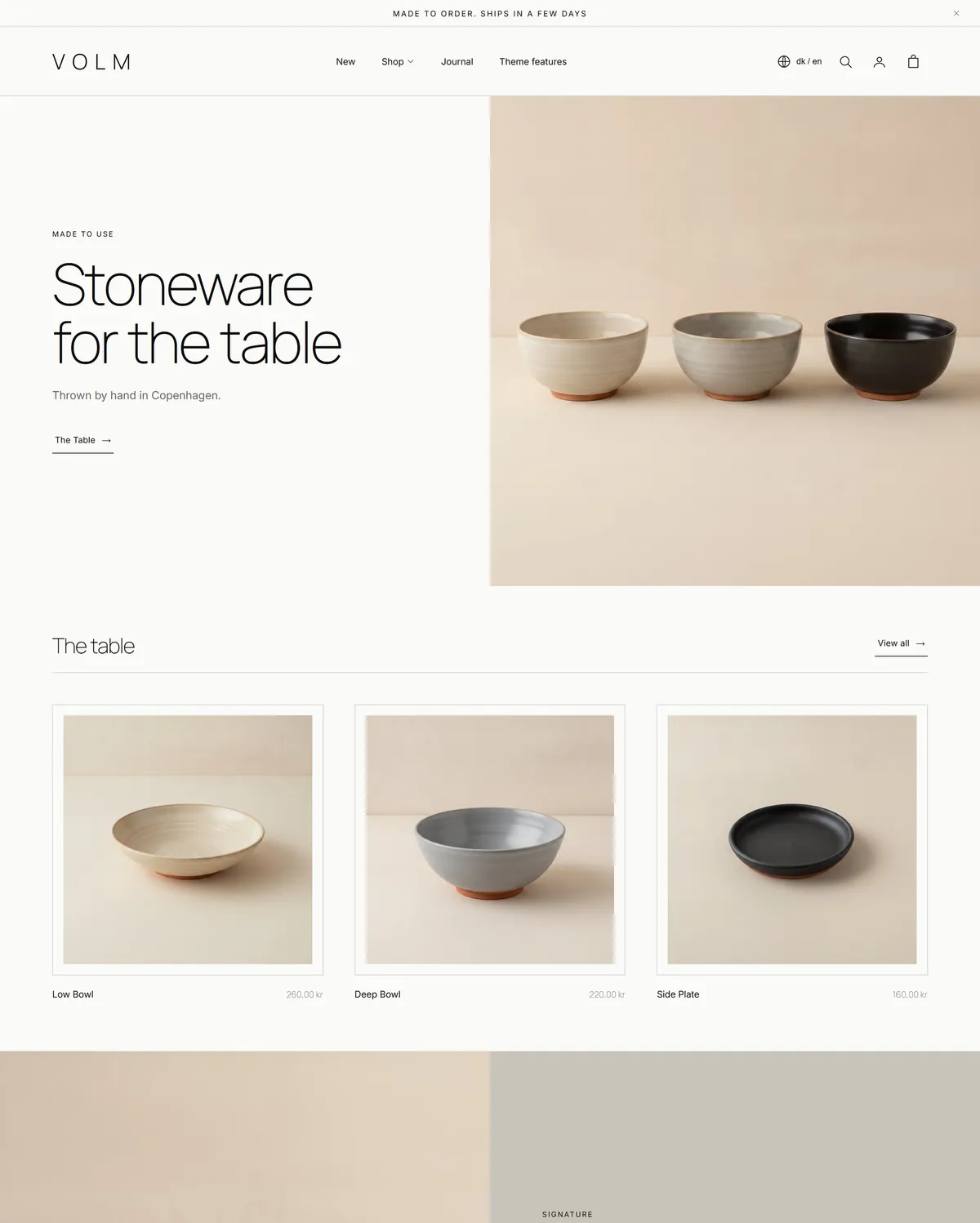
Section titled “Build the homepage, section by section”- Hero opens with one large photograph and a single line of type, “Stoneware for the table” here. Use your strongest lifestyle shot and one short sentence.
- Featured collection pulls products from your catalog into a grid, headed “The table”. Point it at what a first-time visitor should see.
- Image with text pairs one photo with a short paragraph, giving a single product its moment as “Our signature mug”.
- Before and after puts two images behind a slider the visitor drags, showing “Bisque to glaze”. Any two-stage change works, raw and finished, or plain and styled.
- Icon list carries five short promises with a small icon each, under “Our way”. Swap in your materials, shipping, or care points.
- Image hotspots places three markers on one photo, “A table, laid”, each opening a product. Use a scene where several of your items appear together.
- Media grid runs four images with no heading at all, a quiet break partway down. Detail shots and texture suit it.
- Image with text returns lower down for the studio story, “From a studio in Copenhagen.” Your about paragraph belongs here.
- Steps lays out four numbered stages under “How a piece is made”. Use it for your process, or for how ordering works.
- Accordion answers five common questions under “Questions, answered”. Shipping, returns, and care are the usual three.
- Newsletter closes with a sign-up, called “The kiln list” here. Give yours a name that sounds like your brand.
Around all of it sit the persistent pieces: an Announcement bar above the Header, then the Footer and a Bottom bar. Cart and search both open as drawers over the page.
Set the look
Section titled “Set the look”These are the values behind the style, all found in Theme settings.
- Typography. Headings in Manrope at a light weight, body copy in Inter, and the same Inter for captions and labels. Headings stay in normal sentence case, small labels are uppercase, heading letter spacing sits at -3%, and the hero heading runs at 72px. See Typography settings.
- Corners, borders, and depth. Square corners on cards, buttons, and inputs, a card radius of 0, borders drawn as a 0.5px hairline, and no shadow. See Corners, borders, and depth.
- Buttons. Solid, inverting fill and label on hover, with labels in normal case. See Button settings.
- Icons. A light 1.2 line weight, chevron markers, and the square bag cart icon. See Icon settings.
- Animations. Expressive motion at medium speed, so reveals are present but unhurried. See Animation settings.
- Layout. Narrow page width, which keeps text at a readable measure. See Layout and spacing settings.
- Cart. Opens as a drawer, so adding one more piece costs no navigation. See Cart settings.
- Colors. Five monochrome schemes and no accent color: paper white with near-black text, a warm grey, a full inversion of near-black with pale type, a mid stone grey, and a softer grey pairing. See Color schemes.
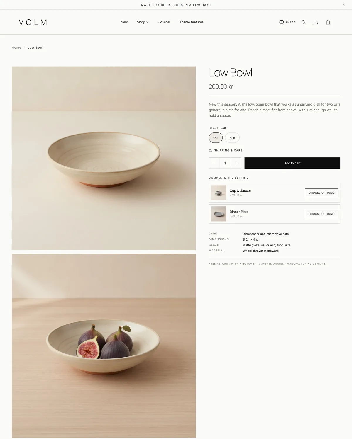
Product cards use the matte image frame with title and price on one row, which is what makes a grid read as a set of framed photographs.
Bring your own material
Section titled “Bring your own material”- Photography matters most. Large, calm, well-lit shots on plain or natural backgrounds carry the page, and consistent light across your catalog is worth more than any single setting.
- Words. Short headings and a few unhurried sentences. The layout leaves space for restraint, so resist filling it.
- Navigation. Build your menu in your Shopify admin, then choose it in the header. A small menu suits this style.
- Collections. The featured collection, the hotspots, and every product card draw from your catalog, so organising collections first makes the homepage fall into place.
Keep reading
Section titled “Keep reading”For what each homepage section can do, see the sections reference. For everything you can change store-wide, see theme settings. Questions about Shopify itself, such as building menus, are answered at the Shopify Help Center.