The Patchbay demo store
Choosing Patchbay applies the layout and the settings you saw on the demo, then fills them with your own catalog, so your storefront reads as your brand rather than a copy. Demo photography does not travel with a theme style, since those images are licensed to the demo store, so day one shows your products in the Patchbay shape. That is how it is meant to work. This page is the recipe for closing the rest of the gap.
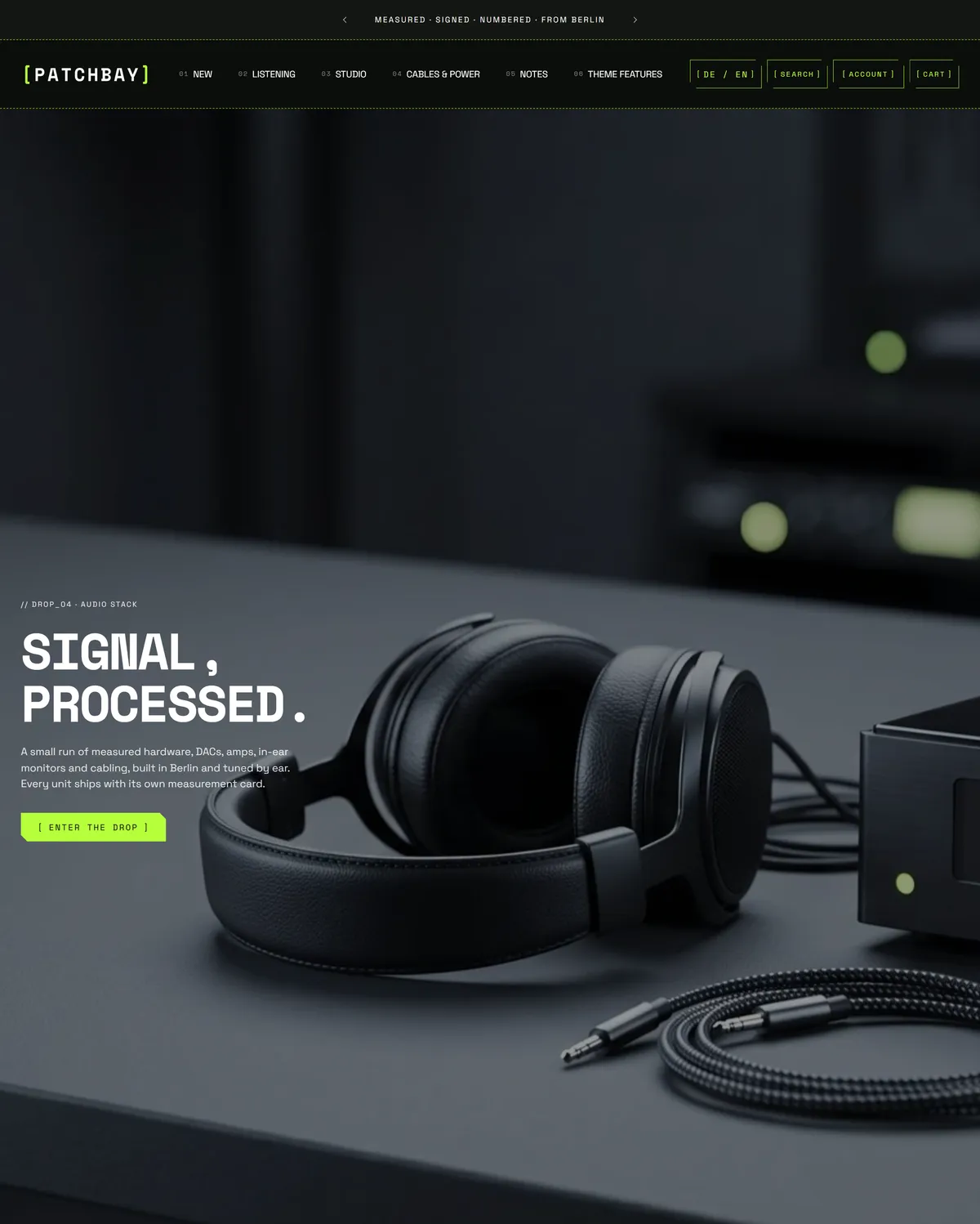
Rebuild the homepage in this order
Section titled “Rebuild the homepage in this order”- Hero. A full-bleed opening image with one short, declarative line over it. Use your strongest product or workspace shot.
- Featured collection. A products row pulled from one collection, so the catalog starts before the first scroll ends. Point it at your best sellers.
- Collection list. Three blocks, one image per category. Use it for the main groups people browse by.
- Image with text. A wide image beside a paragraph on where and how the products are built. Your origin story or founder note goes here.
- Icon list. Four icon and label pairs covering the reasons to buy. Swap in your warranty, shipping promise, and returns policy.
- Countdown. A timer running to a launch moment. Use it for a drop, a restock, or a sale ending, and hide it when nothing is scheduled.
- Steps. Four numbered blocks on what happens after an order is placed. Use it for your build time, testing, or dispatch.
- Testimonials. Three customer quotes. Replace them with real reviews and real names.
- Event calendar. Two dated entries for in-person sessions. Use it for markets, workshops, or launch nights.
- Logo list. Five marks in a quiet row. Use press mentions, stockists, or certifications.
- Newsletter. The sign-up that closes the page. Say what subscribers get and how often.
The demo also carries a Multicolumn and a Shoppable video section that are switched off, so you will find them in the editor ready to turn on once you have the content for them.
Around every page sit the persistent pieces: an announcement bar above the header, a footer with a bottom bar below, and a cart drawer, search drawer, promo popup, and age verification when you want them.
Set the details that make the look
Section titled “Set the details that make the look”- Typography. Headings run in Space Mono bold, in capitals, letters pulled tight, with the largest display size at 64px. Body copy is Space Grotesk regular, and small labels use Space Mono, also capitalized. See typography.
- Corners, borders, and depth. Sharp button and input corners, no card radius, and the angled cut corner switched on. Borders are a fine 1px, drawn dashed, with an accent glow giving cards their depth. See corners, borders, and depth.
- Buttons. Outlined in the accent color rather than filled, labeled in capitals, with a glow on hover. See buttons.
- Icons. The code marker style, which adds bracket frames and slash labels, at a line weight of 1.7, with the slim bag cart icon. See icons.
- Motion. Expressive animation at the fast speed, so transitions feel precise rather than leisurely. See animations.
- Layout. A wide page, so grids can run long without feeling cramped. See layout and spacing.
- Cart. A slide-out drawer, so adding an item never interrupts browsing. See cart.
- Color. Near-black backgrounds with white text and a signal-green accent carry most of the store, alongside a slightly lifted dark scheme, a pale scheme for contrast, and a full green panel for moments that need to shout. See color schemes.
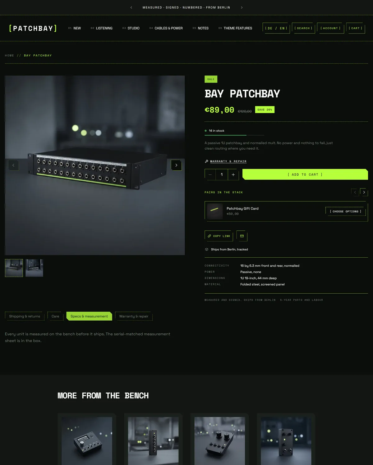
The product page inherits all of it, so your photography lands inside the same dark frame and technical type with no extra work.
Bring your own material
Section titled “Bring your own material”You will need product photography at a consistent size and mood, your own words in every section above, a navigation menu that matches how people shop, and collections built before you point sections at them. Short, confident copy carries this style best: specifications, measurements, and plain claims beat marketing language here. Set your logo and accent color early, since both repeat on every page.
Go deeper
Section titled “Go deeper”For what each section can do and every setting it carries, see the sections reference. For the store-wide controls behind the look, see theme settings. For questions about Shopify itself rather than the theme, visit Shopify Help.